
 Image 1 of 3
 Image 2 of 3
 Image 3 of 3
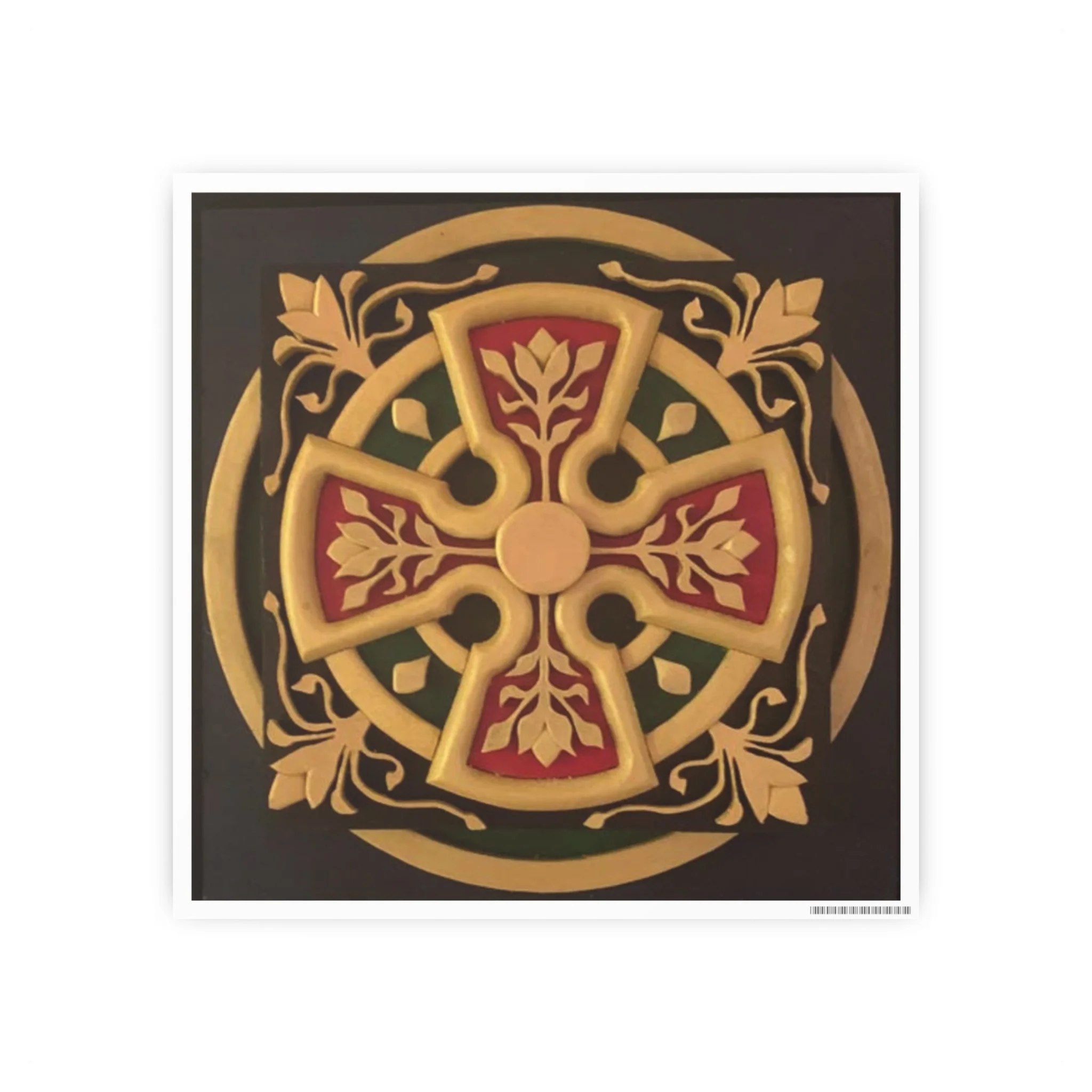
Original Artwork: 12" x 12", mixed wood and polychrome
It starts off with form: The cross - vertical axis, relationship with God; horizontal axis, relationship with humanity. They're not separate relationships; they are a unified whole. As well, the psychologist Carl Jung felt that wholeness is typified by opposites on perpendicular axes:
The circle squared: The circle is a symbol of eternity, the wholeness with no beginning and no end. the square is a symbol of nature: four seasons, four directions, four seasons, etc. The circle squared is a symbol of the oneness of nature and the transcendent.
The color gold is the base. Gold the symbol of the glory of God. Green the symbol of nature. Blue the symbol of eternity. Red is a symbol of blood. In the context of a cross, Christ's blood is the human life essence flowing through the veins of God. In this piece, red is what ties green (eminence) with blue (transcendence). The eminence and transcendent are one.
Hans Urs von Balthasar was a 20th Century theologian, and where he enters in is that he felt theology is barren without beauty. He felt that the “three transcendentals”: beauty, truth and goodness, together provided the fullest picture of God's love. He felt that the prevailing theologies of his day (early- to mid-1900s) neglected beauty. He spent his career advocating for beauty as an equal pillar along with truth and goodness as the basis for sound theology, and therefore of spiritual wholeness.
For the most part, I don't think the current day church has heard him. So often I perceive one pillar: “truth”.
Note that the images of nature in this piece are gold, the color of God's glory, not green. I believe that nature is sacred and proclaims the glory and love of God.
.: Material: 210gsm (9mil) premium paper stock with smooth satin finish
.: Please note: Each poster features a white 0.5cm border with a small barcode